Empower donors to make a difference at impactful events through our mobile-friendly charity event platform
Timeline
3 weeks
Platform
Mobile responsive
My Role
UX designer
Introduction
Ray of Hope, a Singapore-based crowdfunding platform for charities. It helps individuals and families in need to connect with donors and raise funds for various causes. They also provide additional support services to their beneficiaries.
My Role
As a UX designer, I worked closely with fellow designers Marvin and Bernard and our project lead, Alicia, throughout the project.
Problem
Creating impactful fundraising events can be a challenge for charities due to inefficient tools, resulting in a fragmented event registration and donations process. Furthermore stretching already tight budgets for some commercial options.
Goals
Ray of Hope wanted a platform catering to charities and donors, with features including event organization, data collection with donor registration, and a streamlined donation process.
With Ray of Hope's needs in mind, we're focusing on the donor interface, creating solutions in three key areas :
Impact
The positive feedback from 20 participants:
The Outcomes
User Research
Through these methods, we aim to uncover users' goals, behaviors, platform and feature preferences.
*Both research methods included anyone that is at least 18 years old and had made a charitable donation within the past 5 years.
Our Findings
We noticed that most users prefer monetary donations:
Understanding the key factors that influence donor decisions for supporting different charities:
*All factors are calculated in percentage
Prioritizing these five factors:
This creates an user centric platform that promotes engagement and impact.
What platforms do users typically use to make donations ?
Our survey revealed that users value mobile for exploring events and purchasing tickets, while they prefer desktop for donation tracking and downloading tax deduction receipts.
This highlights the need for a responsive design that adapts seamlessly to different screen sizes, meeting their needs regardless of device.
*Refer to Approaches No.1 for this section.
Analysis of the market
(Competitive & Comparative Analysis)
To identify priority features and interfaces for our design, we're analyzing successful features from existing platforms.
Donation platforms
Event platforms
Understanding our product
(SWOT Analysis)
Defining the issues
Understanding the issues will help us empathize with users’s goals and pain points.
Users
We need to understand the users’ behavior and goals before designing the product.
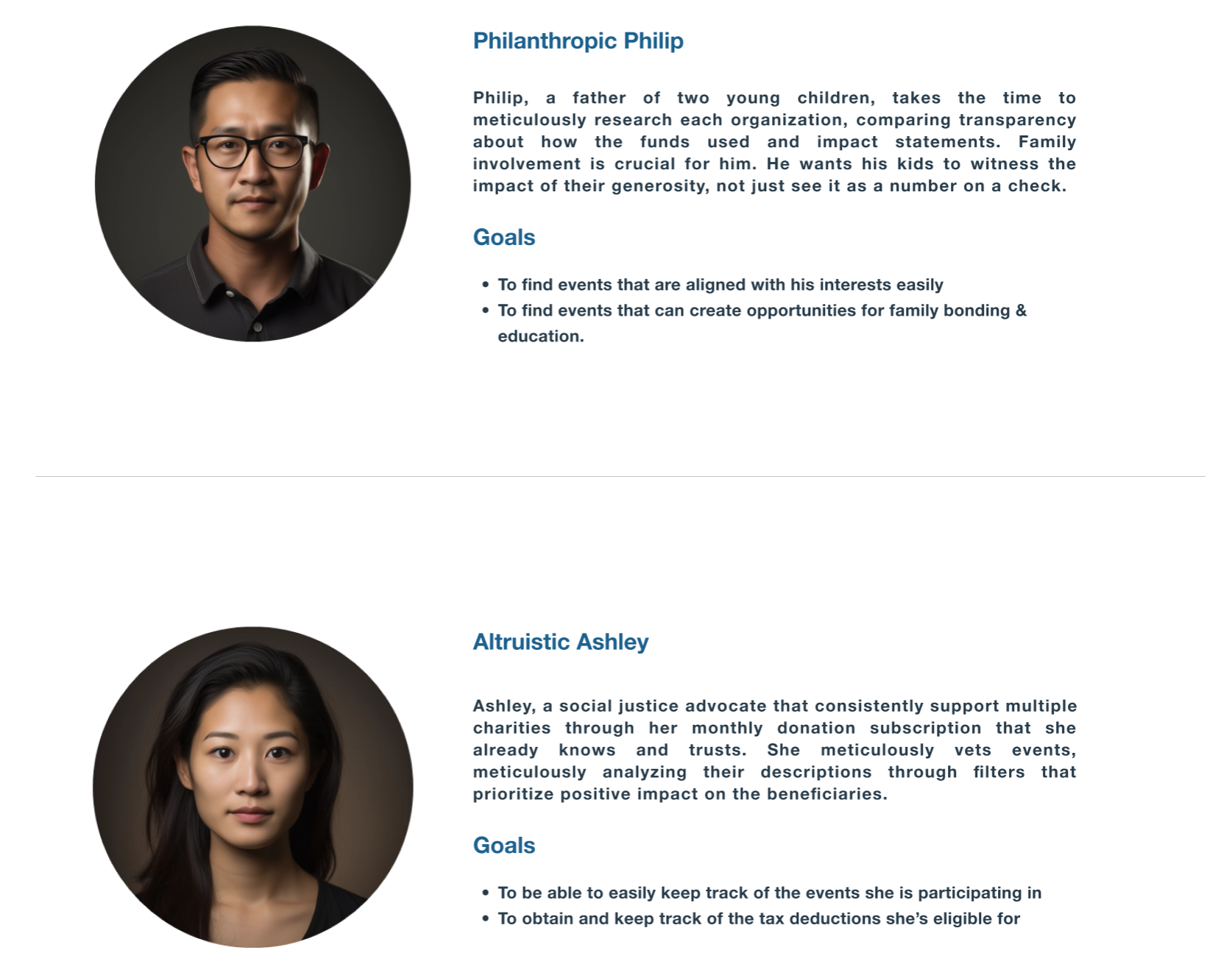
We characterized 2 archetypes and mapped them to their goals.
User Flow
Philip Flow
Ashley Flow
To foster a sense of connection between our platforms, we've created a new name, 'Gift of Hope’, and a logo that shares a similar color grouping.
Process
Design systems for UI and Visuals
We chose a palette of distinguishable analogous colors, featuring blue as a symbol of reliability, to convey trust and stability.
We chose to retain the font type, a versatile and minimalist sans-serif typeface designed for both display and text typography, making it easy for users to read the detailed descriptions of the event causes.
Specifically, we adjusted the leading and kerning, resulting in a cleaner UI look.
2.
a.
b.
c.
3.
1.
Approaches
How can we streamline event exploration and ticket purchasing on mobile and optimize donation tracking/receipt download on desktop?
Develop a mobile-responsive website that has 2 important features:
A smooth and stress-free journey as you browse events and purchase tickets.
How can we help users discover the ideal charity events to enjoy with their families?
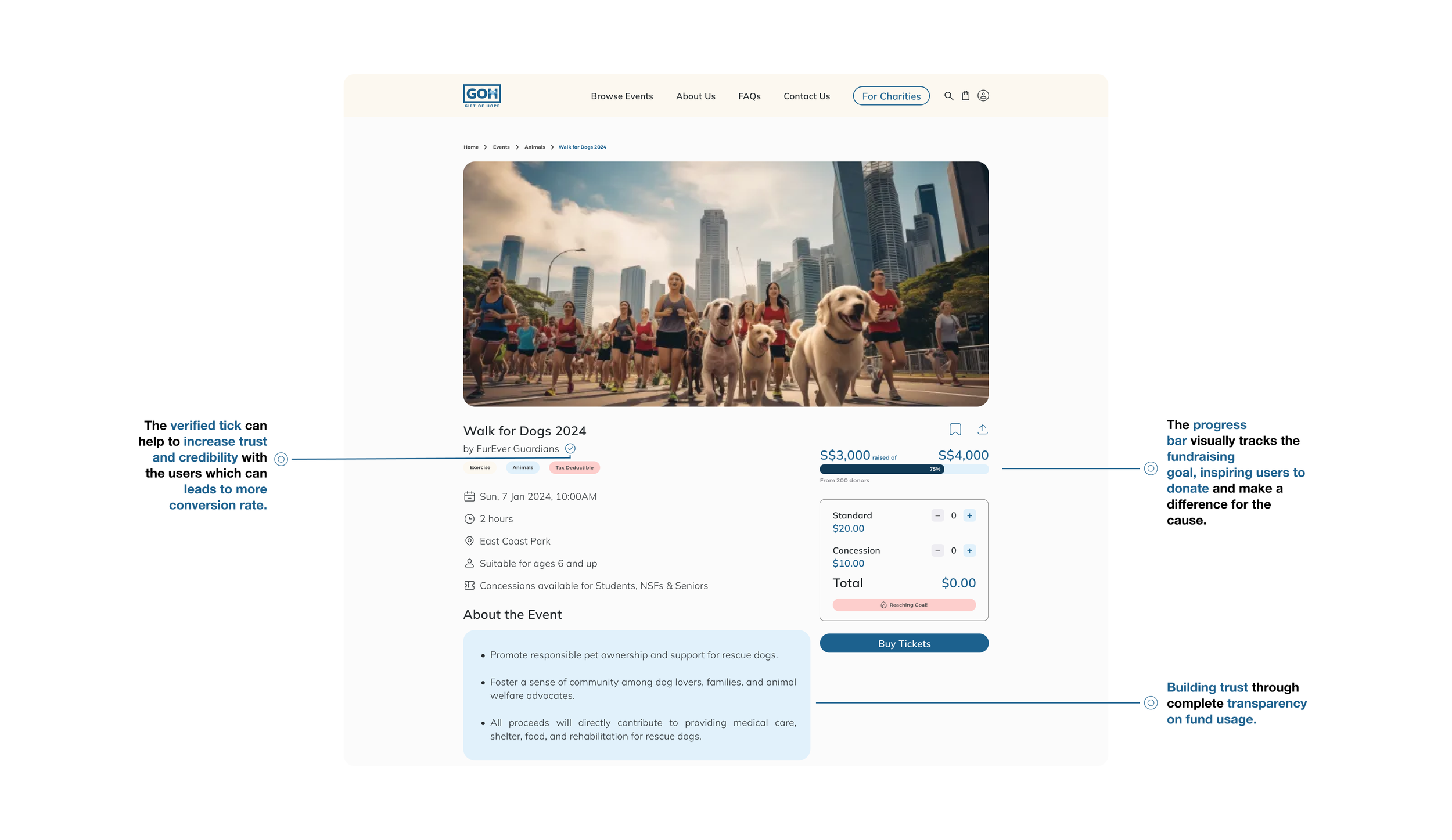
Users want to have transparency about fund usage and verification of the charity's legitimacy.
Present clear and concise information about the event’s impact, fund usage, and charity legitimacy.
Users want to easily find events aligned with their interests.
Implement a user-friendly search bar, relevant event tags, and clear categories to simplify event search.
Users prioritize the positive effects on the benefactors.
Prioritize the visual organization about impacts to imply importance.
2a.
Present clear and concise information about the event’s impact, fund usage, and charity legitimacy.
2b.
Implement a user-friendly search bar, relevant event tags, and clear categories to simplify event search.
2c.
Prioritize the visual organization about impacts to imply importance.
How can we help users have a more efficient way to track their registered charity events and eligible tax deductions?
Users would create an account to track registered events, tax deductions, and download tax deduction receipts.
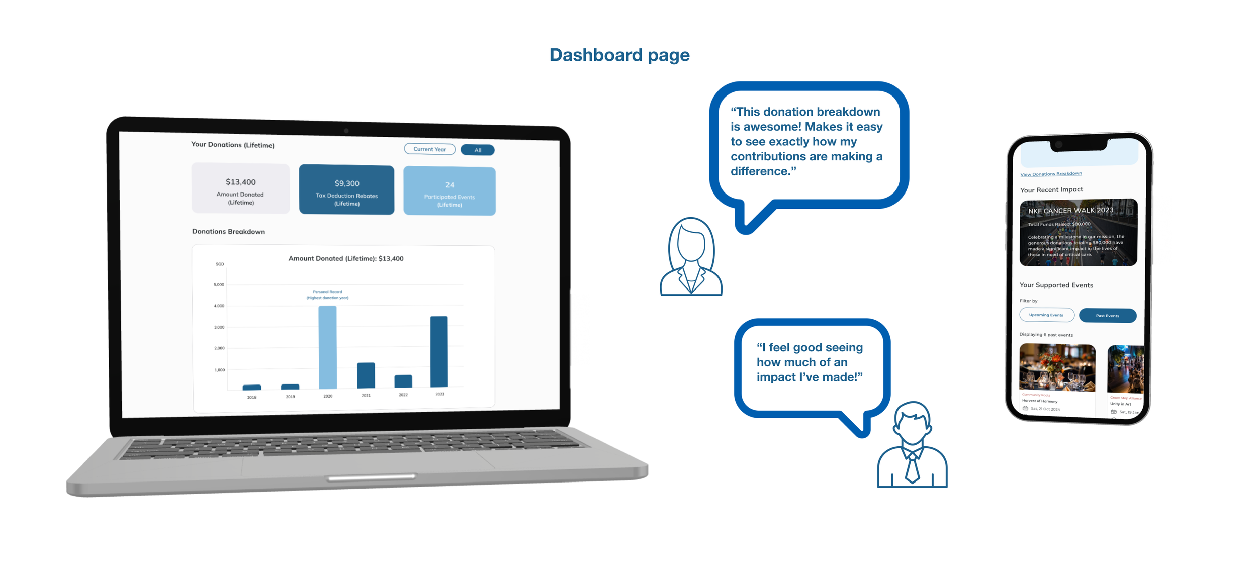
Develop a dashboard that compiles all essential information in a clear and accessible format for the donors.
A simplified overview for donors to track their registered events and tax deductions all in one place.
Usability Testing
Users were given 2 tasks based on the persona we crafted:
1.
2.
-
Users should be able to check their upcoming and past events and download a receipt for tax deductions in 5 minutes with no more than 2 errors.
Users should be able to purchase a ticket to a charity event for their family in 5 minutes with no more than 2 errors.
Average time taken for Task 1
-
-
-
1m 48s
Average time taken for Task 2
2m 14s
Some changes were made during the course for 2 rounds of usability testing based on the users feedback:
Added a"bulk export” button for quick and easy export for all the tax-deductible receipts.
Changed input boxes to text only and added a pencil to serve as an “edit” icon on the dashboard profile page.
Added a “search filter” at home and event pages to allow users to browse by location.
Increased font size and weight for “donation unsuccessfully” at donor dashboard, and replaced tick with a cross.
Our product scored a System Usability Scale (SUS) score of:
85.1!
Pre/Post
Browse page
Event page
Login page
Recommendations
Learnings
Adapt to customer behavior
While staying grounded on our goals is crucial, we also need an open mind and the ability to adapt the project to meet our client's actual needs. Neglecting their priorities or lacking empathy could hinder their product improvement journey, which goes against our mission.
Communication is important
As the front-end team for our charity platform, “Ray Of Hope”, this is our first real-world project. We focus on the donor interface while the other team is the back end that focuses on the charity interface. We actively collaborate with the back-end team, listening to their needs and integrating their functionalities seamlessly. This teamwork ensures a comprehensive platform that promotes user trust and increases positive impact for the causes we support.
Being collaborative in a team produce quality product
During these 3 weeks, our team leveraged our different skillsets while maintaining an open mindset to explore other areas. Example UI designs, UX research, and always willing to help each other under tight timelines, nurturing a united spirit.


