Redesigning a mobile-friendly app to empower an inclusive future
Timeline
2 Weeks
Platform
Mobile-first responsive
My Role
UX Designer
Introduction
SG Enable leads disability inclusion in Singapore, empowering people with disabilities to live, learn, work, and enjoy life. It promotes fairness through innovation, social change, and partnerships, striving to create a more inclusive society.
My Role
I led the user testing and some ideation of the project from end to end. I worked with 2 UX/UI designers (Marvin, Ron) for this project and the project lead (Sharimane) throughout the entire project.
Problem
SG Enable offers job listings, training workshops, and disability information. Users find the website confusing and prefer to use the hotline for information.
Goals
Impact
User research
Through conversations with 12 people, we gained a valuable understanding of these key insights
Users
Before designing the product, we need to dive deep and understand the behavior and expectations of the users.
Utilizing the research data from the interviews, we concentrate on the user's goals.
We created 3 user archetypes and mapped them to their goals.
Defining the problems
Understanding the user goals, we devised some solutions.
Information Architecture for Job listing and Training workshops
We realized that the current organization and structure of the website were hindering usability and accessibility.
In doing so, we ensure users can navigate and interact with information in a way that aligns with their needs and expectations.
Early designs
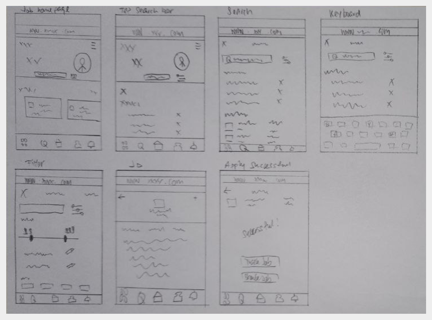
To outline the layout of navigation bars, search bars, and images, we created low-fidelity mockups for the job portal's key pages, informational and workshop pages.
Job portal pages
Training workshops pages
Information pages
User flows
We mapped out each archetypes to their user journey on the web app, with their respective goals
Ian’s user journey
Calvin’s user journey
Emma’s user journey
Competitive Analysis
By doing competitive analysis, this will help us to know how we can enhance user and business strategy. Keeping user’s attention by showing us we can outdo our competitors.
Our design systems for efficiency
Color guides, components, type styles and the good stuff.
Legibility is key when choosing fonts for different devices, as users need to access information clearly and user-friendly on both desktops and mobile phones.
We've opted to maintain the current website's color palette. This decision ensures consistency with our brand identity and enhances user recognition.
There is another reason why we chose those colors and fonts.
Have you come across WCAG?
WCAG defines how to make the web accessible to people with a wide range of disabilities: visual, auditory, physical, speech, cognitive, language, learning, and neurological.
It includes four guidelines: perceivable, operable, understandable, and robust.
*Contrast checker for text
Above 7:1
Pass compliance level AA
Final design
Job portal pages
Training workshops pages
Information pages
Usability Testing
*Take note as we ask 10 users to do UT for different features for this project.
Users will be able to apply for a customer service job in under 7 minutes
with no more than 1 error.
Users will be able to register for communication training in under 5 minutes with no more than 2 errors.
Users will be able to find information on sensory disability in under 5 minutes with no more than 2 errors.
Users will be able to find a centre with assistive technology in under 5 minutes with no more than 2 errors.
Recommendations
*Take note as we ask 10 users to do UT for different features for this project.
Task 1
Filter section: Types of disability to be placed on top instead of the bottom.
Filter section: Include a “done button” at the bottom.
To include an “additional remarks” section for PWDs to specify their condition.
Task 2
To include training costs.
To include more details to fill up to register for the training such as the demographics.
Others
To include a segment on the latest news on the home page.
Current website vs revamp
Homepage
Text Heavy, High cognitive load.
Seamless designs to make it less text-heavy and easier to understand to find information, apply for jobs, or workshops.
Before
New Feature- Accessibility Shortcut Menu
After
Before
Training Section
After
PDF format is given, not visually appealing and users will have no interest in looking at it.
We redesigned it by putting pictures for different types of training which it is sorted accordingly.
An example of a feature for dyslexia friendly.
New features such as an accessibility shortcut menu that has a screen reader, contrast, dyslexia-friendly, adjusted text size, etc.
In the future…
Short Term (1 - 3 weeks)
Conduct a content audit to identify areas of complexity or redundancy, and revise the content to be more concise, clear, and targeted to the user personas.
Main focus
Focus on restructuring SG Enable Information Architecture and Site map to optimise content for searchability.
Medium Term (3 - 12 weeks)
Build out other key features such as grant applications for PWDs and Caregivers.
Continuous Improvement & Community Building
Focus on building a supportive community through forums, discussion boards, and regular events or workshops.
What i have learned
Never assume
I realised getting more in-depth insights from various users is important for us to find their pain points and needs, especially throughout the SG Enable project. Assuming their needs are impossible, we aren’t them.
Leave no man behind
Working with a supportive team of skilled and creative individuals during this course has been a rewarding experience. We cover each other’s weaknesses and guide each other to improve our skills and the project.
Mindful as always
This project is about designing a mobile-first responsive website that empowers both caretakers and people with disabilities. Our research approaches their needs with respect, and inclusivity to foster a seamless and convenient user experience.


